
I blame Excel. As clients push back on timelines, often innately believing that visualization of most projects should be an afterthought, I find myself regularly blaming that omnipresent spreadsheet. For many ad hoc analyses performed in the-software-that-shall-not-be-named, modeling and number-crunching is performed by an analyst. Once analysis has been totally completed, that same analyst then goes through a quick effort to generate simple graphs to present those results. For smaller scale analysis, this is a perfectly acceptable working model. But bringing that ad hoc mindset to large scale projects, especially projects whose insights are intended to be continuous, belittles the important role that visualization should play.
More than graphs
Visualization of an analytics project is a powerful tool of enablement in its own right. It is a simple reality that the complexity of many advanced modelling techniques will be lost on the end users and decision makers who ultimately utilize the results. Visualization is often the only way to bridge that gap in understanding. Incredibly complex modelling efforts can and should have simple, easy to understand visual outputs to ensure the value capture of the project and its integration into ongoing business practices. The most accurate and transformative analysis means little if the end users cannot quickly and easily interpret the results. But simple to understand does not mean it is easy to build. For visualization to bridge that all important understanding gap, there must be a robust effort to coordinate with current business practices and to tailor the visuals to best fit the actual users. The first step in our process is to develop Analytics Stories to truly understand the overall process and how analytics should fit in. From there, we create mock-ups that are realistic and give the end users an idea of how this will fit into their business processes. The combination of Analytics Stories and mock-ups strive to answer the question: What actions should be driven by these visualizations? Tailored visuals that drive insights are developed through multiple rounds of user feedback in an iterative process that starts at the very onset of a project. Allowing for a higher degree of user input allows insights to be digested more easily at the project’s conclusion. This also allows the analytics team to better understand the data requirements of the visualization itself, which helps for more seamless model development and maintenance.
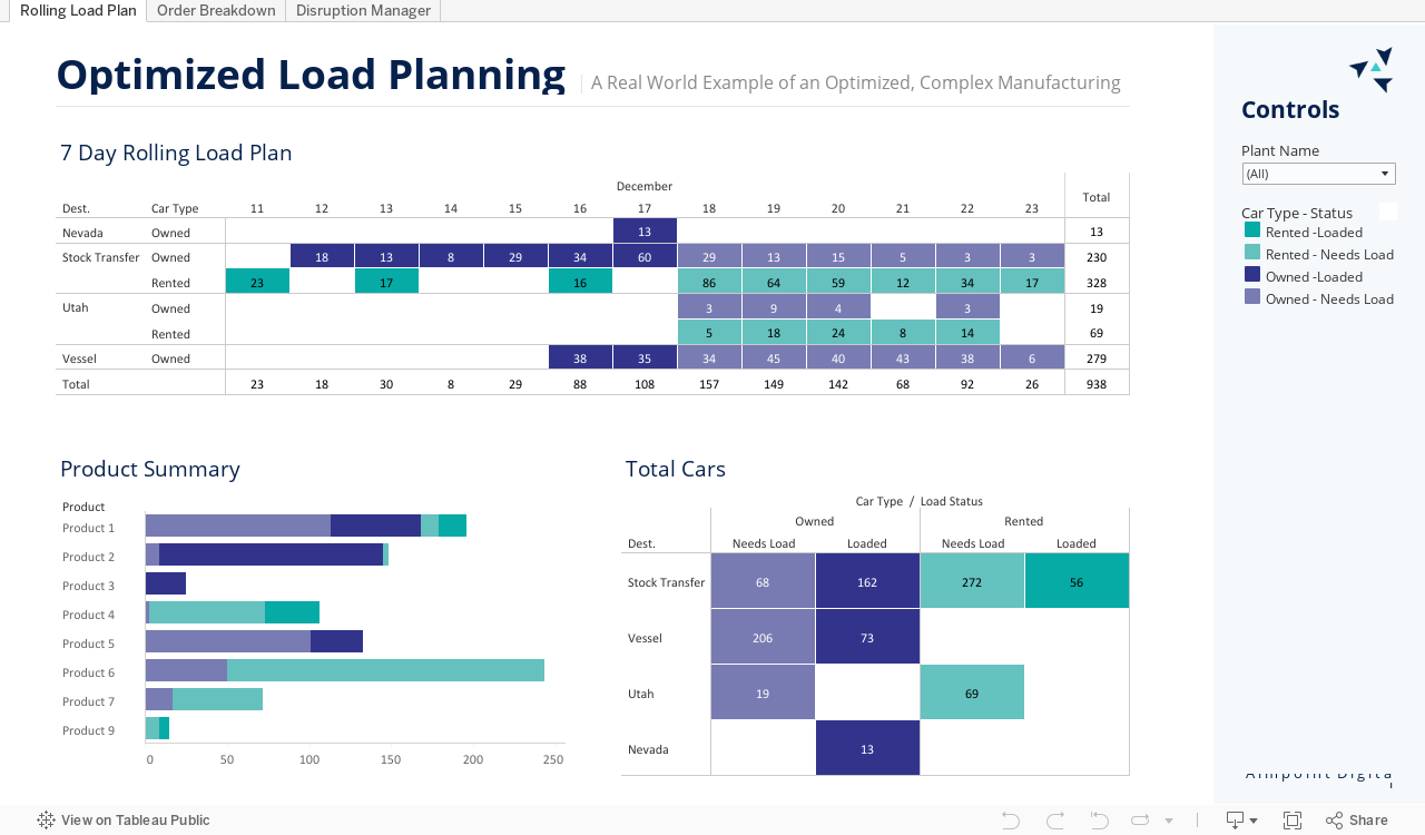
A complex, genetic algorithm output led to easy-to-understand series of tabular dashboards.
Visualization tooling
There are a wide range of available tools from BI-focused dashboarding tools like Tableau and PowerBI to visual-focused code packages like D3.js. This myriad of tooling capabilities can feel overwhelming, but like tool selection in the rest of the analytics space, it is all about identifying your needs. A company that is used to ad hoc analysis with straightforward graph reporting will find dashboarding capabilities of Tableau and PowerBI to be transformative, gaining both additional insight and automating current manual processes. Also, many business needs can be solved through integration into those software’s larger platforms for capabilities like automated reporting. Web-based tools that require advanced or live functionality may need to be solved with a more bespoke, coding approach. This advanced functionality comes at the trade off of development time and tool complexity. When wading through the plethora of options in a dense space that goes from Excel reports to comprehensive coding projects, it takes no small amount of expertise to properly match solutions with business needs.
Aimpoint Digital will help you take an idea from thought through execution. This collaborative journey will enable you to get the most out of your data and technology investments. Contact us to begin your acceleration process.


