Nurturing a data analytics and data visualization community is no small task, requiring many facets:
- A platform for employees to learn, share, and ask questions – often called a Center of Excellence or Center for Enablement
- Buy-in from the executive team where they see value in upskilling employees to ensure sufficient training time and support is provided in working hours and training is rewarded
- Rewarding collaborative behavior
- Opportunities for employees to learn and shine
In an effort to practice what we teach to our clients and in wanting to help provide more opportunities for team members to use, learn, collaborate, and showcase their skills with Tableau, I decided to kickstart a monthly internal hackathon.
Hosting the first hackathon on a Saturday, it was expected that turnout and time commitments would be lower than during a workday. With the situation in Lebanon, one of our team members slated to participate, Alex, had flown over to assist (see his blog about the experience here: Help Respond to Crises), and could not make the hackathon. Otherwise, we only had one other member drop out at the last minute. Come Saturday morning I was worried about attendance but was pleasantly surprised as one by one, Aimpoint members would join our hackathon team call. We had users across the board in terms of their Tableau exposure and it was great to see my team help each other achieve their visualization goals. It was also rewarding to see data they were each passionate about.
Throughout the day we would take turns screen sharing, explaining our data, analytic inquiries, and visualizations. Some could only give an hour, some had to spend a long time collecting their data and dealing with data issues, but everyone contributed.
Aimpoint team members collaborating over teams.

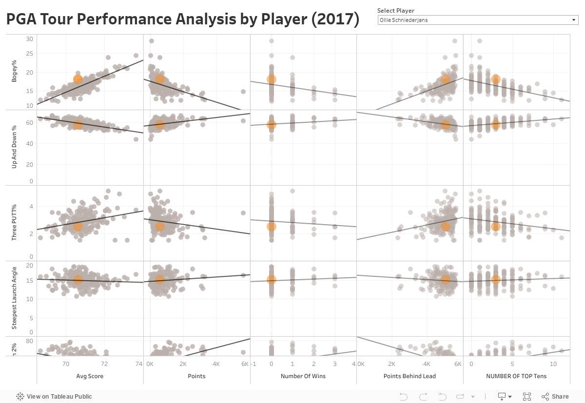
William Miller
In spite of William having had relatively less exposure to Tableau than most of our other participants, he was able to pull out interesting trends from PGA, a topic he was passionate about. Here is what he had to say about his viz:
By analyzing PGA Tour stats from 2017, we were able to develop interesting insights about how small adjustments can make big differences in performance. By far the most important stat from the analysis was "Up and Down%." The difference in being the number one player in the world and losing your PGA Tour status is the difference between getting "Up and Down" 63% vs 54% of the time, which equates to around 1.5 strokes per round. Had I known these insights as a junior/collegiate golfer, it would have changed how I spent my limited practice time. The business world is no different: we can spend our life in an industry that we know inside and out, but there's always room for data and insights to improve your understanding and competitive edge.
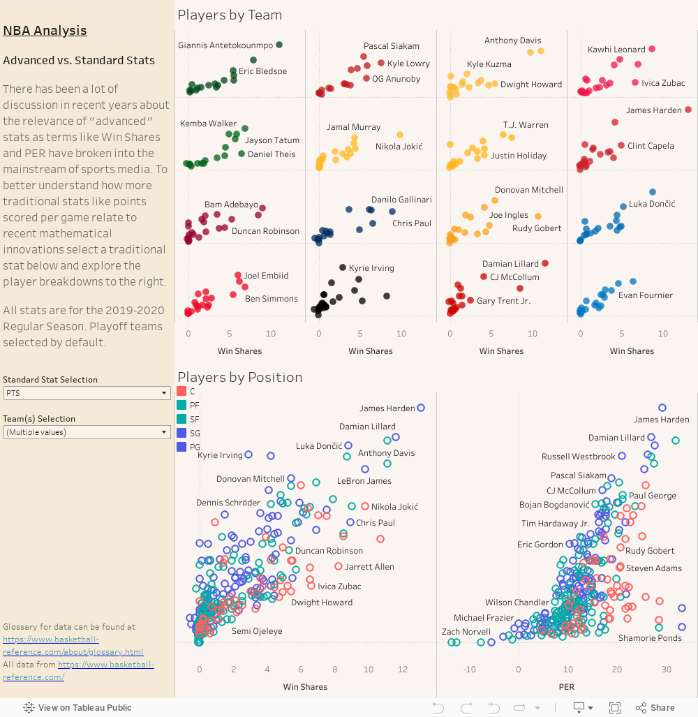
JD Love-Epp
JD also tackled some sports data, this time the NBA. Here is what he had to say about his data visualization:
I created a player-level breakdown of traditional counting stats compared against two selected advanced stats for the 2019-20 NBA Season. Users can switch between traditional metrics to dive into what drives the numeric success of the game's best (and worst).
Max Benjamin
Max took a different approach to the hackathon, mostly wanting to focus on trying Tableau charts and functionality that he had not used prior:
My motivation for creating the viz was to: 1) Create a hex map 2) Understand the different options for doing random generation in Tableau as well as parameter/URL actions. The purpose of the viz itself was given we can't really travel much right now to still be able to discover to new places (that make potentially delicious beer) and daydream of going there (and sampling them).

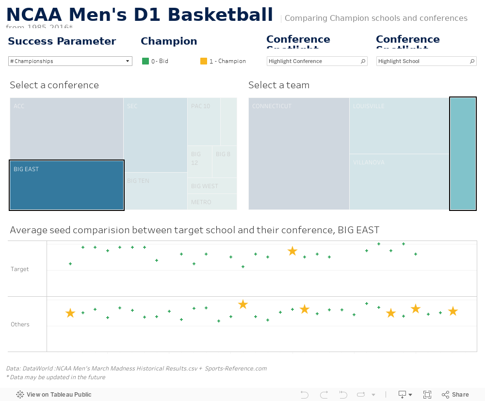
Christa Margossian
Our third and final sports topic, Christa took on NCAA Basketball data. Here is what Christa had to say about her viz:
I wanted to see if there are any trends in NCAA Men's D1 Basketball tournament champions and their conferences as March Madness is one of the best times of the year. I set out to answer: do certain conferences have the lion's share of bids over the ~30-year span? How do the champions compare to others in their conference in terms of bids? At the end of the day, my viz allowed for a deeper dive into individual schools and their win percentages as well as school comparisons to the rest of their conference.
Mina Ozgen
I have a strong interest in gaming data, so it was to little surprise that I used Diablo 2 map data for our hackathon. Here is what I have to say about my own viz:
I wanted to address the holy grail of Diablo 2 speedrunning (people trying to beat a game as fast as possible), which direction is the Arcane Sanctuary? In Diablo 2 maps are pseudo-randomly generated. What has been discovered by speedrunners is that map tiles can relate to each other. My data visualization looks at map directions, map assets used and overworld paths of maps prior to Arcane Sanctuary to determine Arcane Sanctuary direction biases. I battled with data quality and sample size issues for much of my hackathon and did not get my data and data viz to the state I wanted it to be but I was nonetheless happy to work on a topic I was so passionate about.
This was a fantastic collaborative and learning experience and I am looking forward to continuing this monthly series.
Author